User Tools
Sidebar
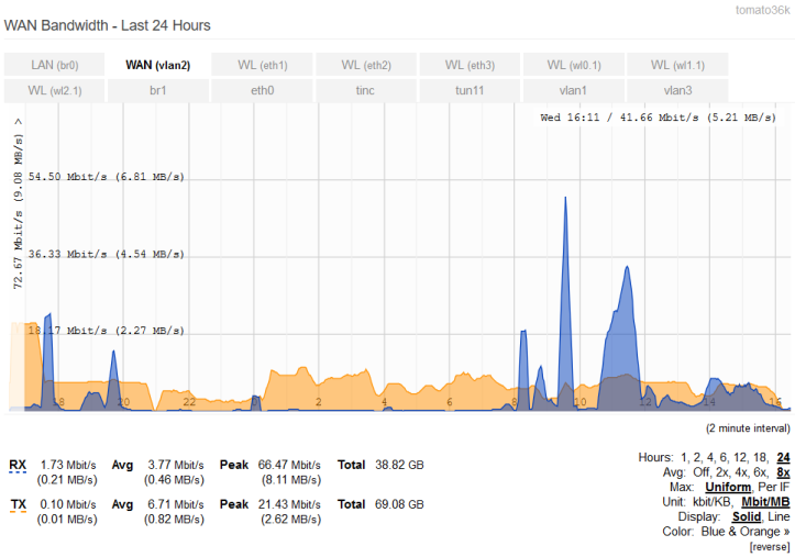
Bandwidth - Last 24 Hours
The Bandwidth - Last 24 Hours menu displays bandwidth usage from the last 24 hours.
The time window is 24 hours and data resolution is 2 minutes. It displays a maximum of 24 hours of data sampled a maximum of every 2 minutes.
The graph data aren't saved with bandwidth usage data. They will be lost after a shutdown/reboot/power loss. Thus, it is normal for the chart to be empty after a reboot.
Hours: changes the time period of the graph data displayed.
Avg. applies a percentile display to show how a data point compares to the total distribution over time.
Max:
- Uniform - scales graphs to the maximum value recorded on all interfaces.
- Per if (Per Interface) - scales the graphs based on data from one interface only.
Unit:
- kbit/KB - displays bandwidth volume data in kilobits/Kilobytes (x1,000).
- Mbit/MB - displays bandwidth data in Megabits/Megabytes (x1,000,000).
Display:
- Solid - represents usage with an area graph.
- Line - represents usage with a single line graph showing only maximum values.
Color: switches between various pre-specified color schemes for the graph.
[reverse]: reverses the graph color scheme. A device traced in blue would be traced in orange and vice versa.
General Features
Cursor-Tracking Readout: Graphs heave a a Cursor-Tracking Readout. Moving your mouse over the graph makes it display at the top right:
- Day of the Week
- Time
- Bandwidth usage
These update when you move the mouse.
The Cursor-Tracking Readout disappears after 5 intervals: that is, 10 seconds in Real-Time, 10 minutes in Last 24 Hours, etcetera.
Mouse-Click Readout: Bandwidth graphs also have a Mouse-Click readout: Clicking on the graph will make the date/time/bandwidth numbers display beside the mouse cursor. Mouse-click readout is static. It does not update with graph movement or scaling.

