User Tools
Sidebar
Table of Contents
IP Traffic - View Graphs
This menu displays pie charts of the bandwidth used for each IP address. Each address's bandwidth displays in a different colour. Each chart sorts connections based on certain criteria. Each section in this menu has a corresponding table with more information.
Connections Distribution (TCP/UDP)
This pie chart shows:
- Bandwidth usage for each address, sorted by the number of
open TCP vs. UDP connections. - In the second column, the number of open connections.
- In the third column, the proportion of total traffic (in percent)
the device is using.
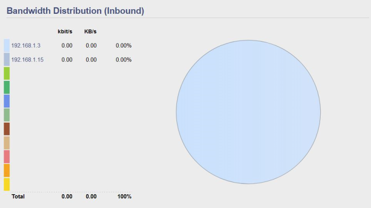
Bandwidth Distribution (Inbound)
A pie chart here shows the bandwidth of incoming (WAN-to-LAN) traffic, sorted by IP address.
A corresponding table displays traffic in columns. For each IP host:
- The kbit/s column displays kilobits per second inbound.
- The KB/s per second displays Kilobytes per second inbound.
- The last column displays the proportion (percent) of inbound bandwidth
that each IP host is using.
The bottom of the table shows:
- Total kb/s for all IP hosts measured
- Total KB/s for all IP hosts measured
- Total proportion of bandwidth (in percent) for all IP hosts measured.
Bandwidth Distribution (Outbound)
A pie chart shows bandwidth of LAN-to-WAN traffic, including the proportion of outbound traffic going to each IP address measured.
A pie chart shows bandwidth of WAN-to-LAN traffic, sorted by IP address. A corresponding table displays traffic in columns.
For each IP host it shows:
- The kbit/s column shows kilobits per second outbound.
- The KB/s per second shows Kilobytes per second outbound.
- The proportion (in percent) of outbound bandwidth per IP host.
At the bottom of the table are shown:
- Outbound Total kb/s for all IP hosts measured.
- Total KB/s for all IP hosts measured.
- Total percent of bandwidth for all IP hosts measured.


