
User Tools
Sidebar
ipt-graphs
This is an old revision of the document!
Table of Contents
IP Traffic - View Graphs
The IP Traffic - View Graphs page displays pie charts of bandwidth used for each IP address. Each address's bandwidth is displayed in a different colour. Each chart sorts connections based on certain criteria. Each section on this page has a corresponding table with more information.
Connections Distribution (TCP/UDP)
This pie chart shows bandwidth usage for each IP address, sorted by the number of open TCP vs. UDP connections. The second column, beside each address, shows the number of open connections. Numbers in the third column indicate the proportion of total traffic, in percent, the device is using.

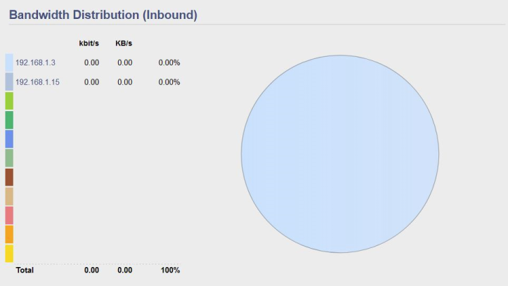
Bandwidth Distribution (Inbound)
A pie chart shows bandwidth of incoming (WAN to LAN) traffic, sorted by IP address. A corresponding table displays traffic in columns. For each IP host, The kbit/s column shows kilobits per second inbound. The KB/s per second shows Kilobytes per second inbound. The last column shows the proportion (in percent) of inbound bandwidth each IP host is using.
At the bottom of the table are displayed:
- Total kb/s for all IP hosts measured
- Total KB/s for all IP hosts measured
- Total proportion of bandwidth (in percent) for all IP hosts measured.

Bandwidth Distribution (Outbound)
A pie chart shows bandwidth of outbound (LAN to WAN) traffic, including the proportion of outbound traffic going to each IP address measured.
A pie chart shows bandwidth of outbound (WAN to LAN) traffic, sorted by IP address. A corresponding table displays traffic in columns.
For each IP host:
- The kbit/s column shows kilobits per second outbound.
- The KB/s per second shows Kilobytes per second outbound.
- The last column shows the proportion (in percent) of outbound bandwidth per IP host.
At the bottom of the table are displayed:
- Outbound Total kb/s for all IP hosts measured
- Total KB/s for all IP hosts measured
- Total percent of bandwidth for all IP hosts measured.
ipt-graphs.1726710703.txt.gz · Last modified: by hogwild